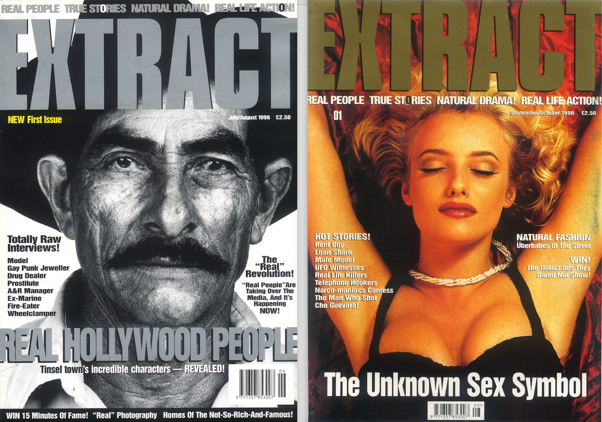
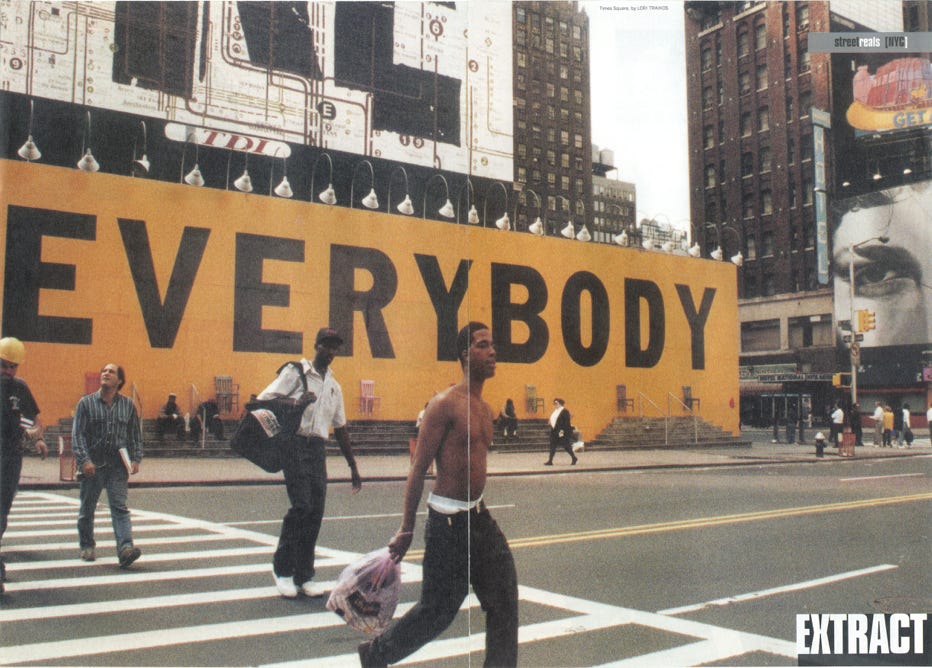
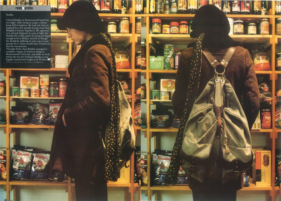
COOL ANONYMITY: Graphic design from ‘Extract’ magazine, which profiled the look, lives and attitudes of life's unknown characters. The magazine was launched on a shoestring by Ben Arogundade in the summer of 1996, and ran for five issues.
PRINT MAY BE IN DECLINE, but good graphics endure. In June 1996, surfing ahead of the zeitgeist for 'reality' media, Ben Arogundade launched ‘Extract’ – a bi-monthly style magazine about non-celebrities. It rejected the lives of the rich and famous in favour of interviews and profiles with unknown personalities from around the world.
PAGE LAYOUT DESIGN INSPIRATION
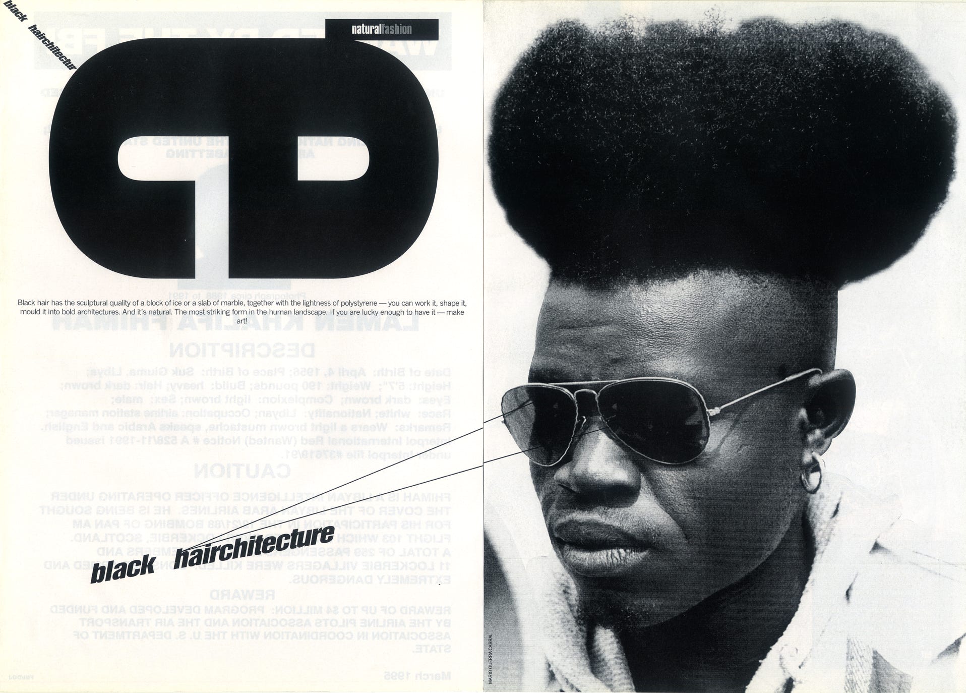
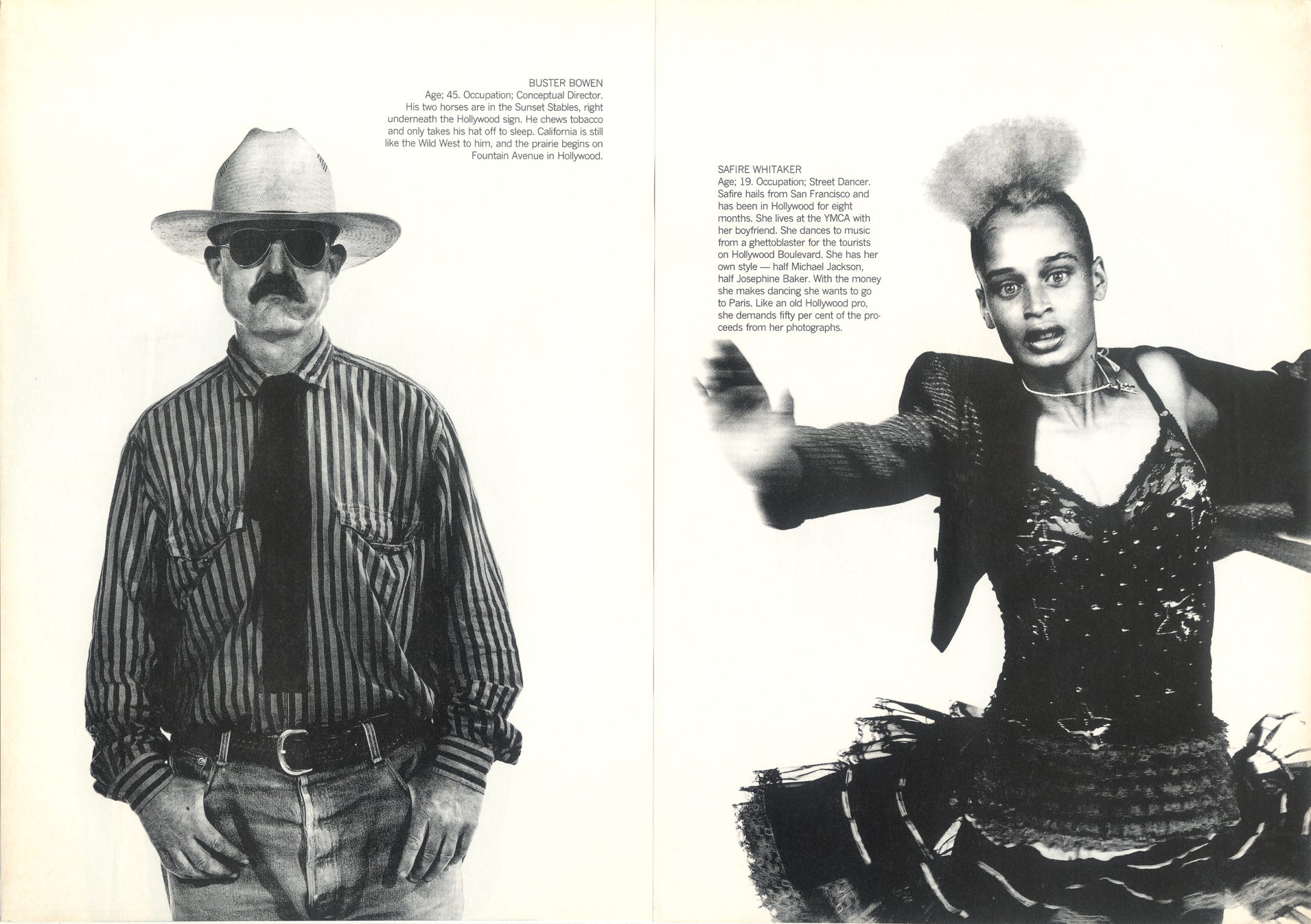
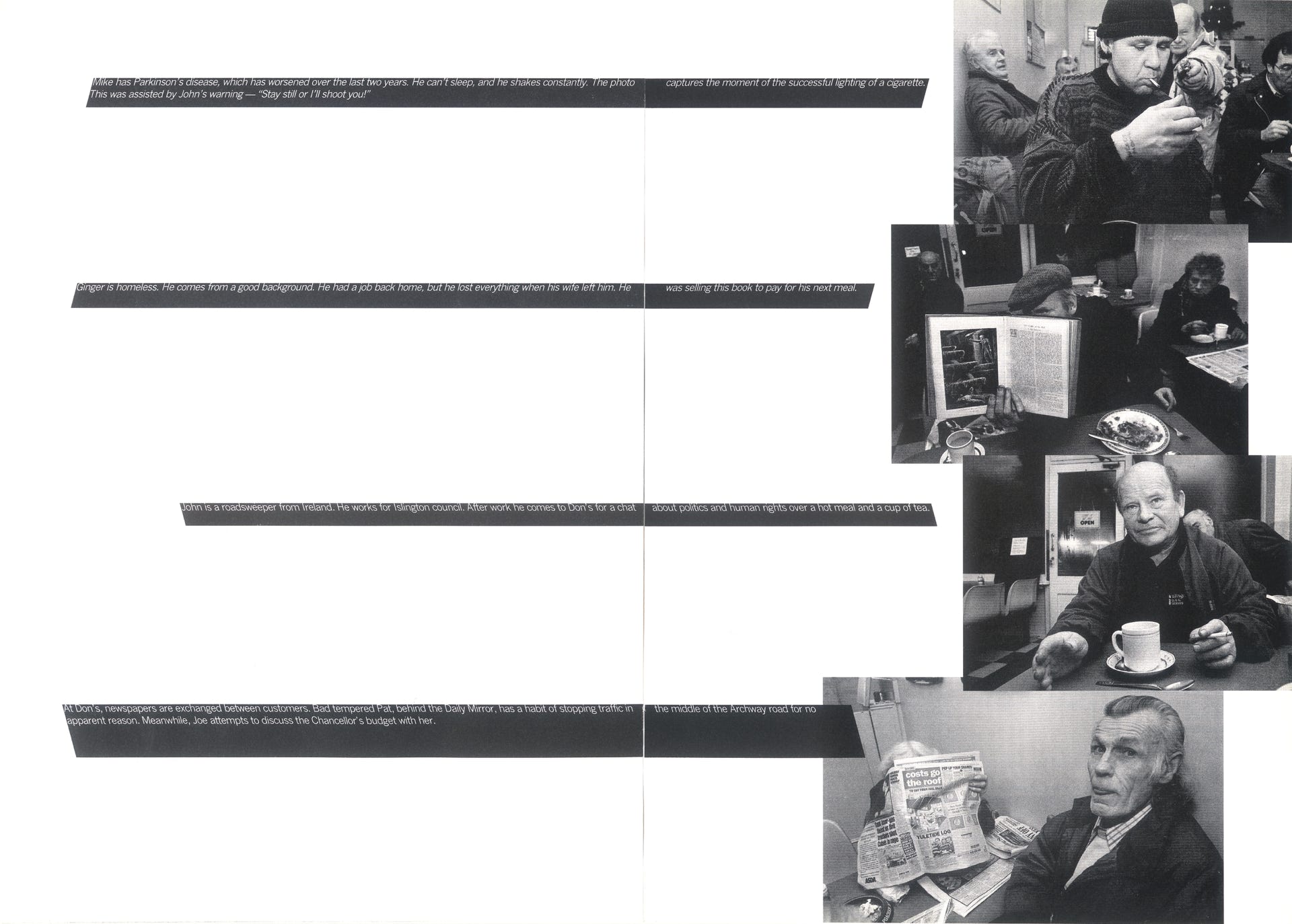
As well as publishing the magazine, Ben also edited and designed its pages. ‘Extract’ attracted international attention, not only for its then radical editorial agenda, but also for its graphic design and creative page layouts, which were conceived to promote large format colour and black-and-white photography, all of which were supplied by an army of talented young British photographers, who were as unknown as their subjects.
ADVERTISING & DESIGN INSPIRATION
The magazine's desire to innovate attracted the attention of some of the eras most renowned creative visionaries. Thomas Carty and Walter Campbell of advertising agency Abbott Mead Vickers BBDO, were the most successful creative team in the history of the industry, responsible, amongst other work, for the famous Guinness 'Surfer' ad. They produced a series of award-winning cinema ads to launch the magazine. One of the executions was eventually banned for its use of explicit content.
‘Extract’ drew a cult audience globally, burning brightly for five issues before eventually folding in 1997. Below is a selection of our favourite page layouts and creative designs, plus the banned TV ad.
ABOUT ME
Hi there. I am a London-based author, journalist and broadcaster Discover more about me and my work at Ben Arogundade bio.
